E-Commerce & Information Architecture Transformation
5 MIN READ
More phone calls than every online conversion path combined. That gap was the actual brief
Information Architecture • E-Commerce Strategy • Behavioural Insight Conversion Design • B2B Product Experience
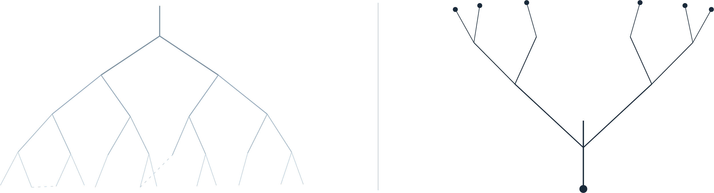
ENTANGLED
STRUCTURED GROWTH
2 sectors
CONSTRUCTION • AGRICULTURE
Legacy → Scale
CORE TRANSFORMATION
STRATEGY DELIVERY
~ 6 weeks
Role: Product Design & UX Strategy Lead | Team: Head of Marketing • Internal Stakeholders • External Dev Agency | Platform: Web & Mobile (B2B E-Commerce Transition)
Two Sectors, One Domain
TKV Group is Australia's largest stockist of aftermarket excavator tracks and undercarriage components for heavy machinery, serving the construction and agricultural sectors. The business was preparing to evolve beyond a legacy B2B web presence toward a scalable e-commerce model.
The business relied on an inventory management system that could show whether a part was in stock, but never its price, and had no path to purchase online. Every transaction still ran through a phone call. Two distinct customer sectors, agriculture (80%) and construction (20%), operated under a single domain with little structural separation.
The website functioned as a brochure. TKV engaged me to provide strategic direction and establish the architectural foundation the business needed before it could become a product platform instead.
Where I Sat in This
Product Design & UX Strategy Lead, engaged directly by TKV's Head of Marketing, with full access to ask questions and to the business's Google Analytics.
Sole owner of the behavioural audit, the information architecture redesign, and the wireframes, through to the final strategy report. Built specifically to support the Head of Marketing's parallel case for a CRM-enabled account model, and to hand cleanly to an external development agency who had no visibility into any of the discovery work behind it.
Phone Calls Were Outperforming Every Digital Conversion Path
3453PHONE CALLS
VS
2783EVERY OTHER CONVERSION PATH COMBINED
The issue was not visual design. It was structural and commercial.
Across the audit period, phone calls logged 3,453 conversions, more than quick quote requests, contact form submissions, email clicks and newsletter sign-ups combined (2,783). Phone calls alone accounted for over half of everything TKV's site tracked as a conversion. Customers weren't ignoring the digital paths by accident, the phone still solved their problem faster than the website could.
The existing site lacked a scalable information architecture capable of supporting a product catalogue, clear segmentation between customer divisions, strong trust signals for technical buyers, and behavioural insight informing navigation and content hierarchy. The audit also turned up a genuine bug: the password reset flow redirected users to a blank WordPress error page, a small thing that would have quietly undermined trust right as TKV tried to move customers online.
The Real Competitor Was a Habit
Three real constraints shaped every decision in this engagement, and the biggest one wasn't technical at all.
Aftermarket heavy machinery parts is a slow-moving, relationship-led industry, and TKV, despite being Australia's largest stockist of excavator tracks and undercarriage components, was competing against decades of buyer habit as much as any website. Ordering by phone meant a familiar voice, no account or password to manage, and paperwork that slotted straight into existing bookkeeping. None of that was friction from the customer's side, it was the whole appeal. Pushing that relationship online risked thinning out the human contact buyers already trusted, and in this sector trust is most of the sales relationship. A redesign had to earn its way into that trust, not assume an interface alone would shift it.
That's also why the six weeks were never about shipping a new experience. The engagement was scoped to produce an evidence-led strategy TKV's leadership could sign off on, not a live product. And because behaviour like this changes in stages, not overnight, I proposed a short-term move (a simple doorstop page letting users self-select their industry) alongside a longer-term one (automated routing based on stored preferences and account history). The split wasn't just a scheduling convenience, it matched how cautiously a change like this needed to be introduced to a buyer base with no reason yet to trust the new channel.
The second constraint was who would build this. I had direct access to the Head of Marketing and TKV's analytics for the length of the engagement. The external development agency inheriting the work would have none of that context, just the report. Every recommendation had to carry its own reasoning on the page: which heuristic it addressed, which data point justified it, what the implementation sequence should be, because I wouldn't be in the room to explain it when the agency picked it up.
The backend added a third limit. TKV's inventory system could show stock, but not price, and had no purchase logic behind it. I couldn't design a checkout that didn't exist yet. So the wireframes were built to convert toward Quick Quote, the real, working conversion path, rather than toward a purchase flow the backend couldn't support.
From Audit to Architecture
1.Behavioural & Structural Audit
I combined a heuristic evaluation against Nielsen's principles with a review of TKV's analytics to understand how users actually navigated the existing site. This revealed ambiguous navigation pathways between divisions, high exit rates from category entry points, limited reinforcement of credibility around specialised inventory, and device-level friction affecting mobile users. It also surfaced the login page anomaly (9.87 views per active user, against roughly 1.5 sitewide), which I flagged as a likely friction signal rather than treating it as confirmed, since the URL staying on /log-in/ after a successful login could also inflate that number artificially. These insights informed a restructuring of the site's taxonomy and user flow logic.To support both commercial growth and internal governance, I proposed a subdomain split separating construction and agriculture, clear division landing pages tailored to sector-specific needs, a scalable category hierarchy aligned with future catalogue expansion, and centralised shared content (support, blog, policies) to reduce duplication. The account dashboard structure was built specifically around the CRM-enabled account model the Head of Marketing was building the internal case for, quick quote history, saved products, order history, in one place, rather than scattered across a phone-based process with no record a customer could return to.
2.Information Architecture Redesign
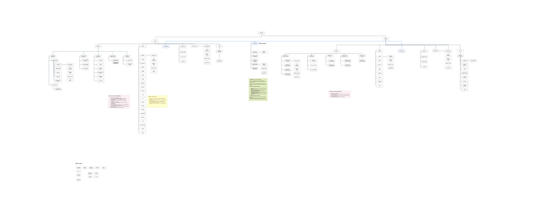
Proposed information architecture separating agriculture and construction into distinct subdomains while centralising shared content to support scalable e-commerce governance.
3. Conversion & Trust Design
High-level wireframes were developed for the homepage, division landing pages, product category structures, and lead generation and account creation zones. One decision worth calling out: rather than linking the Quick Quote button straight to a generic form, I routed it back through the Parts Finder flow. A generic form would have been faster to build, but it risked incomplete or inaccurate quote requests without added validation logic. Routing through Parts Finder cost the user one extra step in exchange for requests TKV could actually act on. Layouts were structured to surface technical support early, reinforce credibility through trust cues, reduce friction in quote requests, and gradually introduce e-commerce functionality, rather than the interface being redesigned cosmetically.
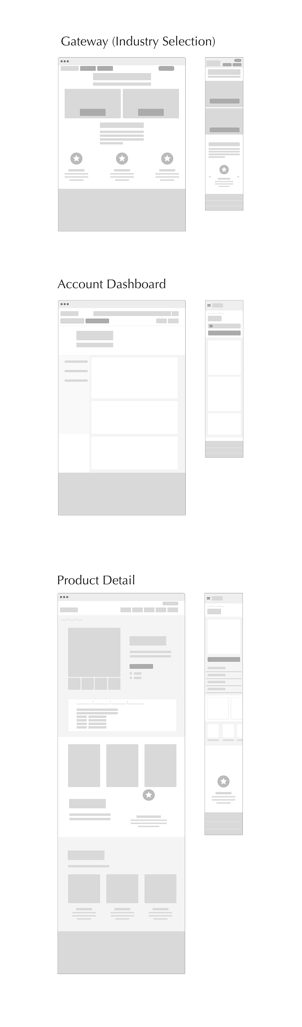
Core platform templates designed to support segmentation, account-based purchasing, and scalable product discovery across desktop and mobile.
From Brochure to Blueprint
A comprehensive UX and IA strategy report was delivered to executive stakeholders, forming the foundation for platform redevelopment. While implementation extended beyond the engagement period, immediate impact included executive-level alignment on digital transformation direction, a clear architectural roadmap for e-commerce enablement, structured separation of divisions to support balanced growth, and reduced ambiguity for the incoming development agency, the exact audience Section 4 was designed around.
The engagement reframed TKV's website from a static presence into a structured digital product capable of supporting future commerce.
What Actually Shipped
Presenting to the C-suite was the plan from the outset, but locking down time with them wasn't within the Head of Marketing's control. It took her more than six months of internal alignment work, drawing directly on the audit findings, to secure that hearing. We stayed in touch in the lead-up, working through details together, and she delivered it herself once the meeting finally happened.
Approval came, up to a point, before the engagement's continuity broke twice over: she moved into a new role, and the business itself was later sold to Astrak Group, a Scotland-based international parts group headquartered in Kirkcaldy.
I've since revisited the live site. Some of the recommendations shipped close to the brief: the "Media" section was reorganised and renamed to "Insights," exactly as proposed, and the mega menu reflects the categorisation I recommended. The Quick Quote concept survived too. The doorstop concept shipped as well, not as a separate landing page but as two industry tiles on the homepage beneath the hero, another variation on the same underlying idea.
Other recommendations didn't make it through. The full subdomain split never happened. Product pages don't surface related content the way I'd proposed. Pricing still isn't visible without a quote request, consistent with the backend limitation I flagged at the time, not something better wireframes alone could have fixed.
“I had the pleasure of working with Paula on the UX and customer-focused design for an eCommerce platform. I can confidently say they are one of the most intuitive, strategic, and customer-focused UX designers I’ve come across. From day one, Paula was able to grasp the complexities of the business and translated them into a seamless and scalable UX framework that not only addressed current customer pain points, but also laid the foundation for future growth. Paula’s approach was thoughtful and data-driven, always considering the end-user experience while balancing commercial and technical realities. Paula brought a combination of creativity and detail, listening, challenging (constructively), and ultimately delivering work that elevated the potential of the ecommerce project significantly. I’d recommend Paula to any business looking for a UX designer who truly understands how to merge customer insight with business impact.”
Reflection
This engagement reinforced that structural clarity has to come before visual refinement. The core challenge was never aesthetic, it was architectural. By separating divisions, clarifying taxonomy, and designing toward the CRM-enabled account model TKV was building a case for, the platform moved closer to commercial maturity.
While implementation extended beyond my involvement, the strategic foundation, from information architecture through to account management, gave the next team a clear pathway to e-commerce enablement and operational efficiency.
It also left me with a lesson beyond the design itself: I'd built the report to survive the dev agency's absence from the discovery work, but not for the client-side turnover that came after. Recommendations need to be durable enough to survive people leaving the room, not just a handoff to a team that wasn't in it. That's something I now design for from the start.
This project sharpened a conviction I still hold: effective product design in B2B environments is as much about governance, segmentation, and behavioural logic as it is about interface execution.
*Selected artefacts have been simplified for portfolio presentation.