Redesigning a Real-Time Marine Monitoring Dashboard
3 MIN READ
Product Design • Sensor Data Visualisation • Real-Time Monitoring • Performance Optimisation •
Dashboard Architecture • Alert Logic • Responsive Interface Architecture
Transforming a noisy live monitoring interface into a decision-ready system scaling from single-vessel to fleet-level visibility


FULL REDESIGN
V1 → V2
NOISE
SIGNAL
WEB • TABLET • MOBILE
3 platforms
REDUCTION IN LOAD TIME
~10s → 3s
Role: UX & Product Design Lead. | Team: CTO • 1 Developer | Timeline: ~ 6 weeks | Platforms: Web Dashboard • Tablet Views • Mobile App (MAUI)
A Templated Dashboard Buckling Under Real-Time Marine Data
The product is a real-time marine monitoring platform surfacing live sensor data across multiple onboard systems. When I joined, Version 1 had been built on a purchased template — functional at small scale, but breaking down as more sensors and vessel configurations were added.
The dashboard needed to balance real-time updates, multiple live sensor inputs, and high-density information display, for both individual boaters and fleet operators — without sacrificing performance or responsiveness across devices.
Instead, it rendered full historical datasets by default. The result:
10+ second delays before full data visibility
Cognitive overload from scroll-heavy, visually dense layouts
No clear hierarchy between critical and secondary data
Limited scalability for fleet operators managing multiple vessels
Version 2 was an opportunity to rebuild the dashboard architecture from first principles — performance-aware and decision-ready, without losing analytical depth.
Sole UX Lead, Embedded with Engineering
As the sole UX & Product Design Lead for Version 2, I owned the dashboard redesign end-to-end, working in close collaboration with the CTO and one developer to translate complex sensor data and backend constraints into a clear, scalable interface.
I led:
Dashboard information architecture redesign
Interaction design and widget architecture
Data visualisation specification (Syncfusion & JS Charts)
Alert state logic and severity hierarchy
Performance-aware UX prioritisation
Responsive behaviour across web and tablet
Multi-vessel scalability modelling
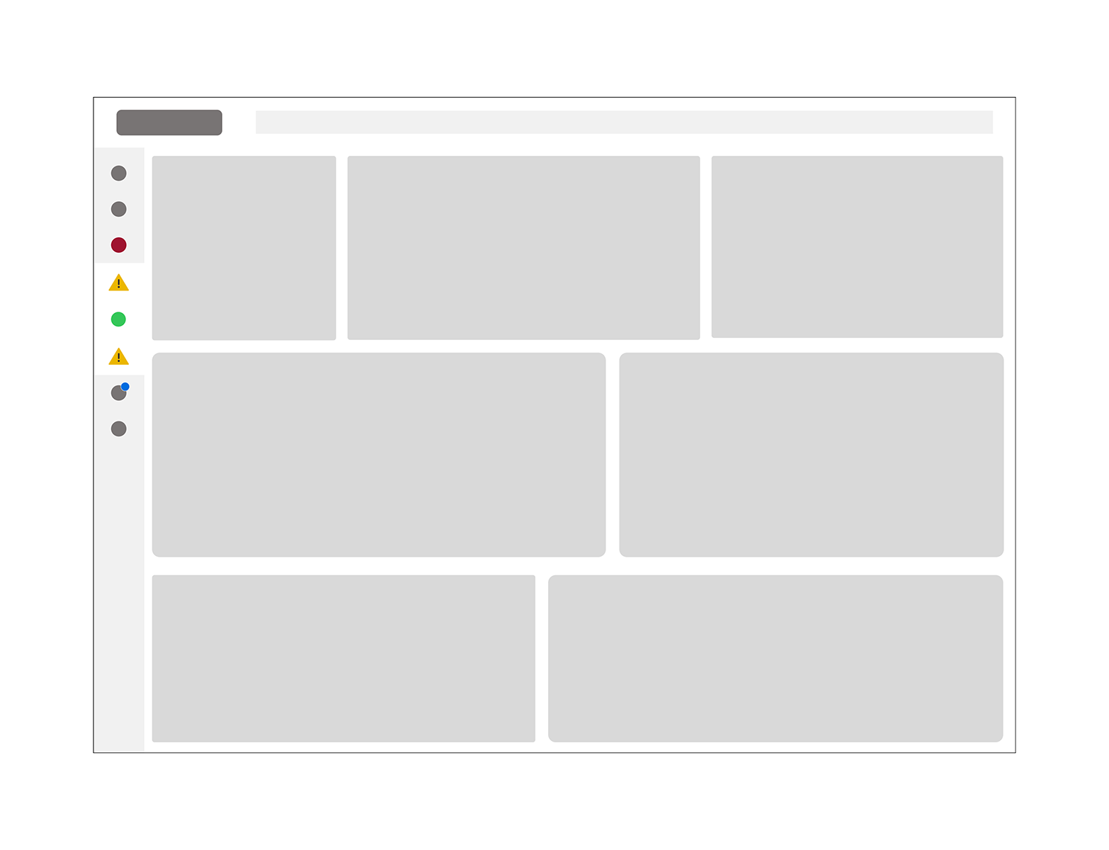
Modular dashboard architecture separating high-priority system summaries from expandable analytical views.
The Redesign: From Raw Data Streams to a Decision-Ready Hierarchy
Restructured Information Architecture & Hierarchy
I defined a prioritisation model separating:
Critical system metrics
Secondary operational data
Historical trend analysis
Data was grouped into logical marine system categories, including:
Critical Systems
Engine
Fluids
Environmental
Alerts
System Information
This improved information architecture and allowed users to triage by system group rather than scanning raw data streams.
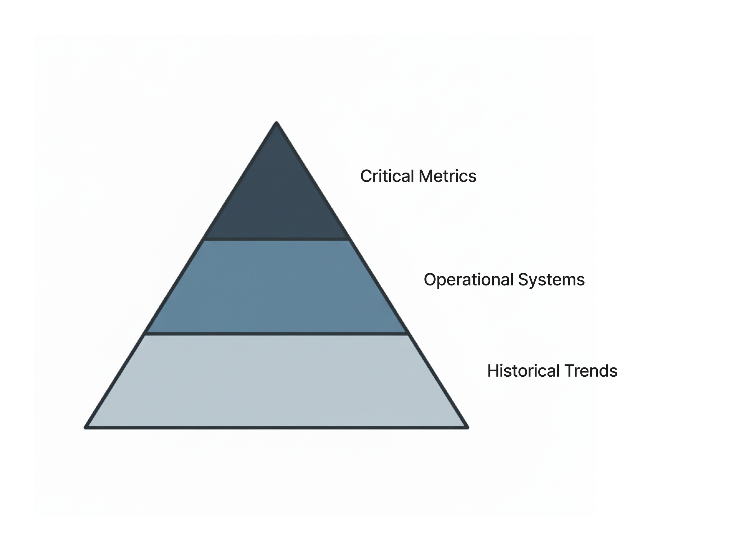
Information hierarchy model prioritising critical metrics above operational systems and historical trend data.
Introduced Modular Widget Architecture
I transitioned the interface from scroll-heavy data blocks to a modular, widget-based dashboard layout.
Each widget:
Displays top-level summaries on load
Loads prioritised data first
Supports tap-to-expand modal views for longitudinal trends
Maintains performance integrity
This modular UX approach reduced visual density while preserving depth for power users.
Performance-Aware Design
Working closely with the CTO, I responded to backend constraints while contributing user-centred prioritisation insights.
Improvements included:
Reducing initial data fetch volume
Extending non-critical polling intervals
Prioritising high-visibility system metrics
Improving perceived performance
Most critical data became visible within approximately 3 seconds, significantly improving user trust and scanability.
Data Visualisation & Alert Logic
Using Syncfusion and JS Charts, I:
Specified chart behaviour and scaling logic
Defined threshold indicators and severity states
Designed alert hierarchies aligned to marine operating conditions
Ensured visual clarity under glare, motion, and variable connectivity
The focus was designing for clarity under dynamic environmental constraints.
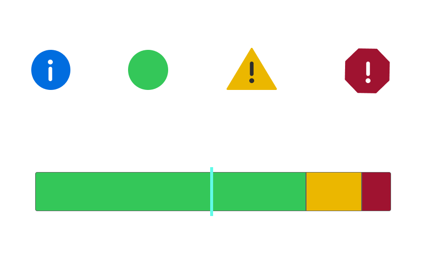
Severity-based alert logic and threshold visualisation supporting fast decision-making in live data environments.
Multi-Vessel & Fleet Scaling
The redesigned dashboard architecture supports:
Single-vessel monitoring
Fleet-level overviews
Multi-input system comparisons
Responsive stacking across device sizes
The interface scales without requiring structural redesign, supporting both individual and commercial use cases.
Outcomes: A Faster, Calmer, More Scalable Interface
While quantitative metrics remain confidential, observable improvements included:
Faster perceived load time
Improved scanability and reduced cognitive fatigue
Clear prioritisation of critical system data
Cleaner multi-vessel overview capability
Reduced visual clutter without sacrificing analytical depth
Version 2 established a more scalable, performance-aware dashboard foundation.
What This Confirmed: Structure Before Style
Designing for real-time, data-dense environments requires balancing performance constraints, cognitive load, and technical feasibility.
This project reinforced the importance of structuring information before styling it — especially when users rely on fast, glanceable insights in dynamic, high-attention contexts.
*Due to confidentiality, selected visuals and artefacts have been simplified or reconstructed for portfolio purposes.